

3X3 Training Brochure

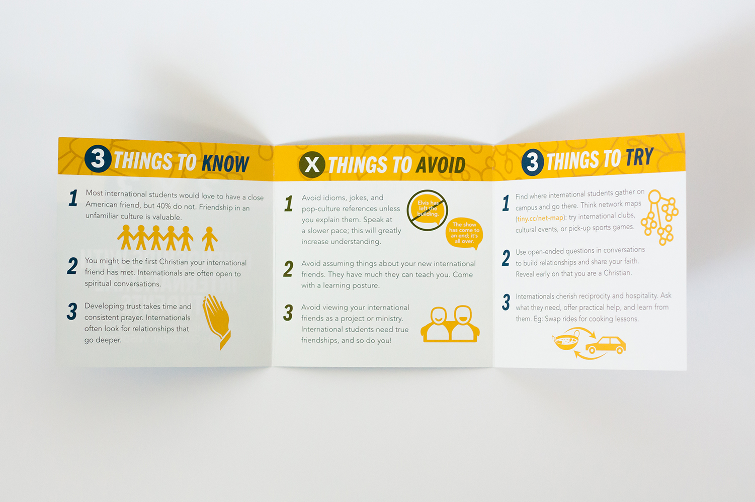
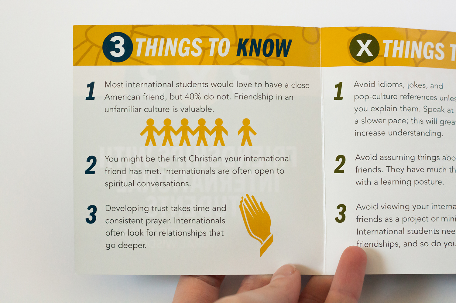
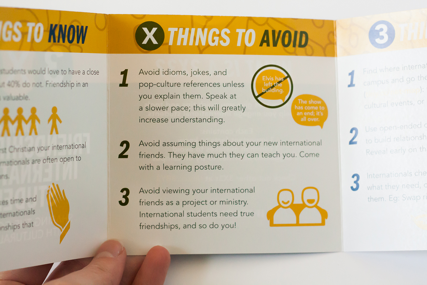
3x3 is a resource for InterVarsity staff or students who do not normally work with international students. They are a bite-sized introduction to various categories of international student ministry. To date, there have been over 85,000 of these 3x3s printed and distributed around the United States.
Before working with the text and layout, I developed a logo and color system for the 3x3s that could flex for nine different designs and maintain a unified look. InterVarsity has a broad network of colors within their brand, but navy is their main color.


The logo has three parts that tie directly to the inside three panels: 3 Things to Know, X Things to Avoid, and 3 Things to Try. The logo elements from the front separate to be three circles for the headers of each inside panel. After navy, the central color in each logo becomes the secondary color, and the overlap color becomes the "negative" color used in the "Things to Avoid" section.
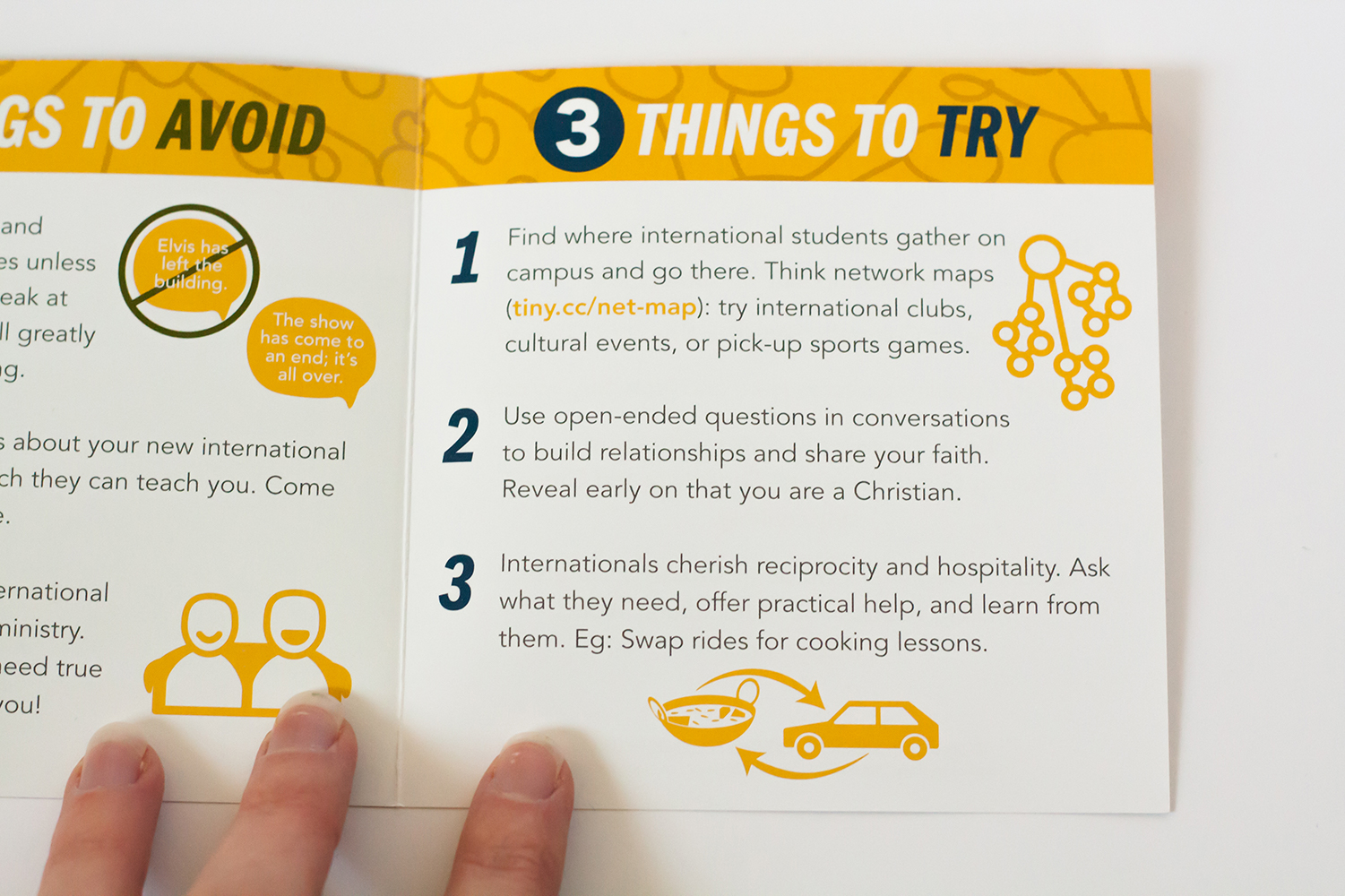


While the project was initially designed for print, I was also asked to create a digital version for easy sharing. Each panel stacks easily to form one long, scrolling infographic-style pamphlet. The pdfs are all linked on the back panel (shown above) at the tiny.cc link.

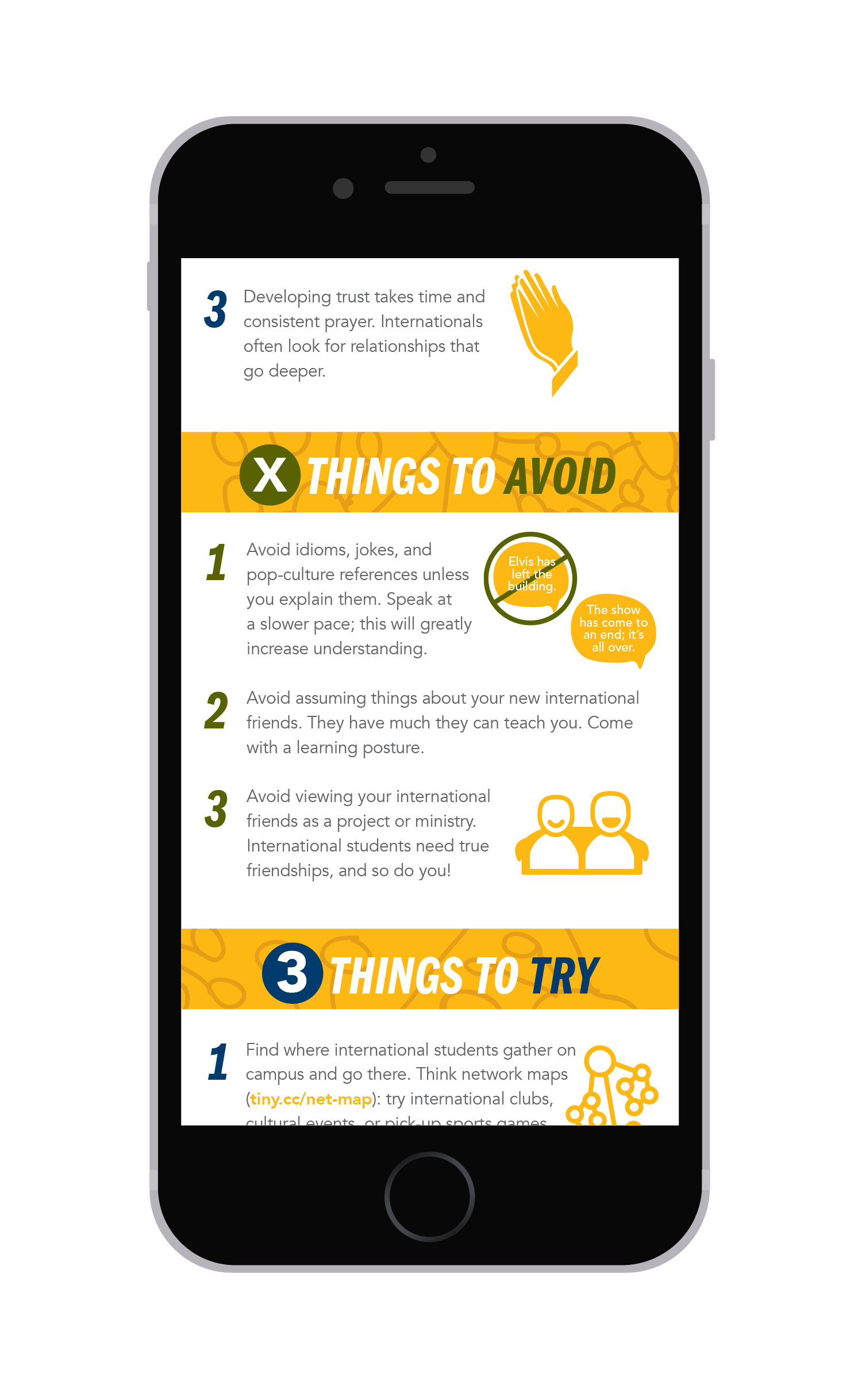

Due to time constraints, the illustrations are all taken from The Noun Project. I was grateful that there was space on each 3x3 to make sure each icon used was properly credited. The background illustrations and patterns for these 3x3s pictures were created by me.