
Responsive Web Design
for Sixty-Seven
Recently, I revisited Sixty-Seven's website, designed in 2013. I maintained the original brand, but went back to the drawing board to determine what an international student campus ministry website should include.
The website’s users are primarily people who want more information about the organization. However, student leaders of the organization will also use the site to quickly access the contact form when they meet new students. All users will mostly use the site on their mobile device, so I started there first.


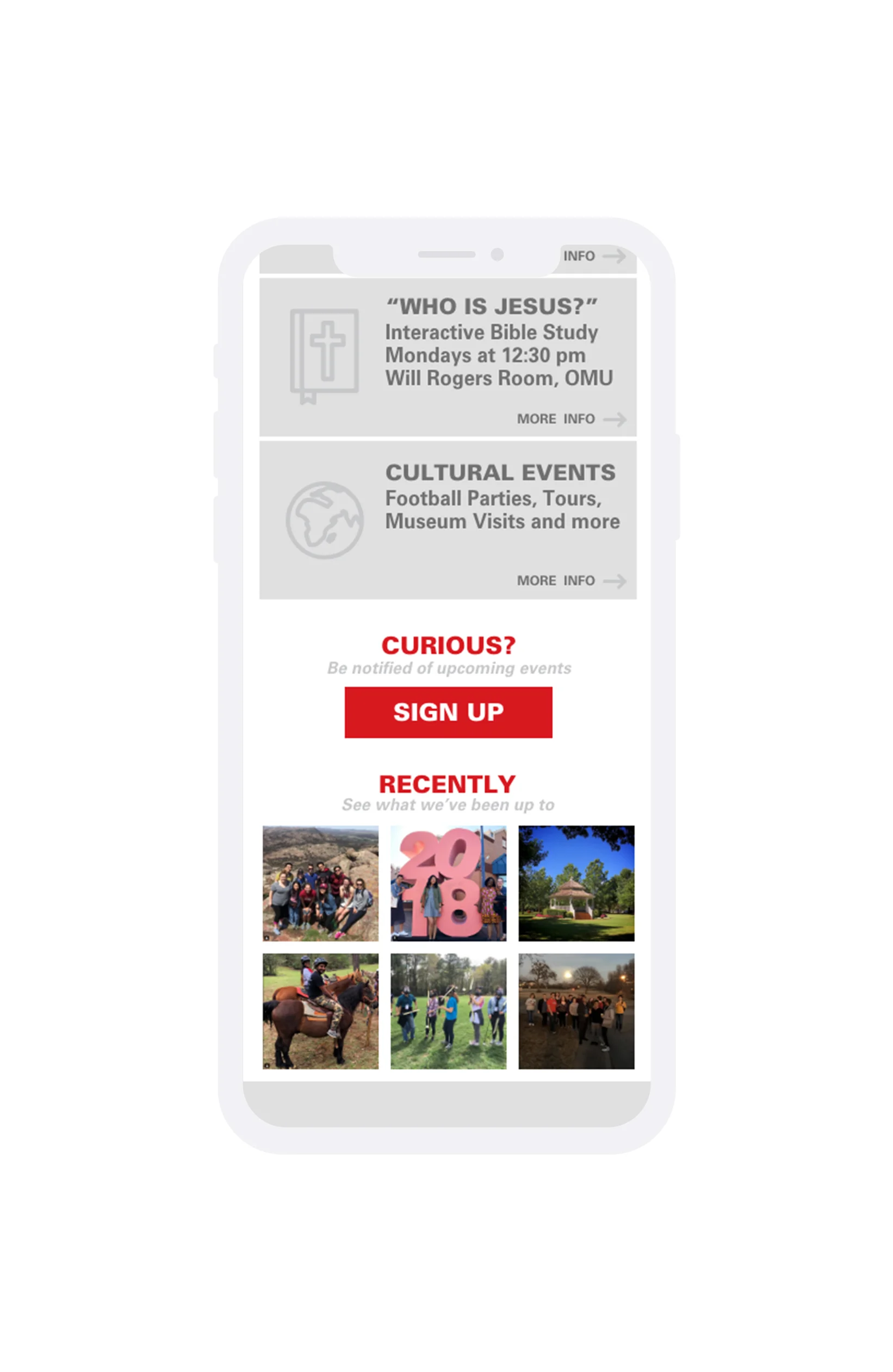
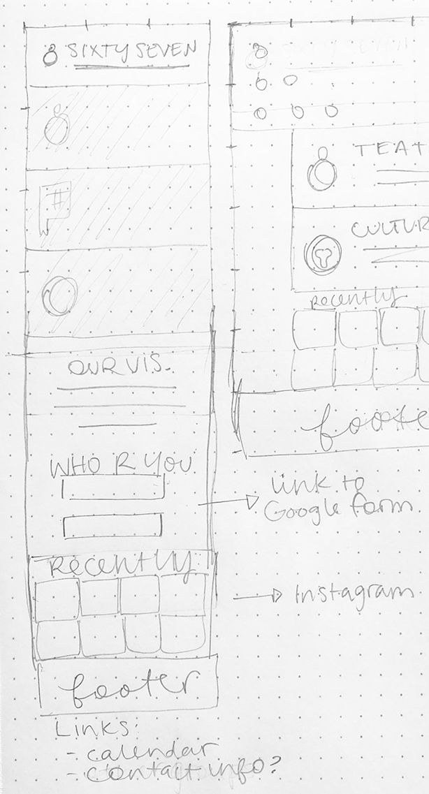
Beginning with mobile web, I sketched out a couple of ideas for the flow of the app. I decided that a longform scrolling page would allow for the right amount of information to be displayed at one time. If a student is on their way to an event, but they need to check the location or start time on their way, I wanted them to be able to go to the site directly from their phone and not need to click anything.
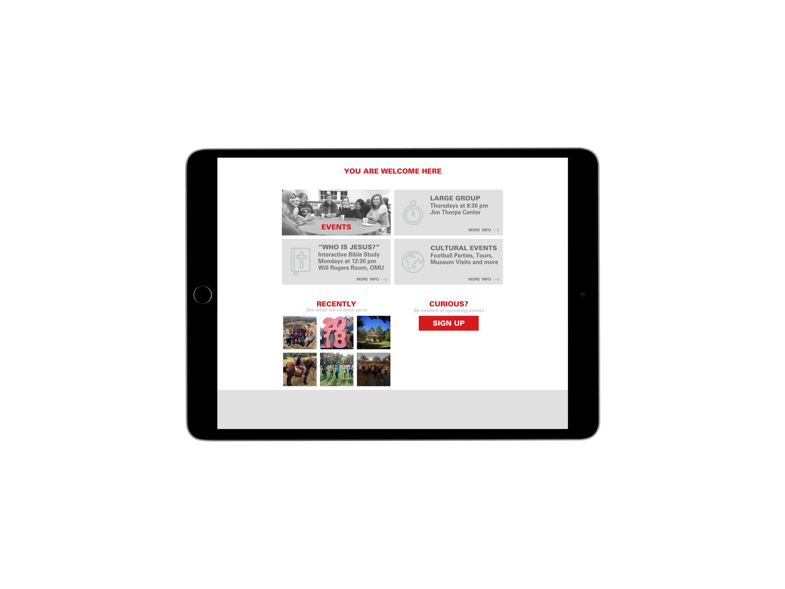
After sketching the large, informative button option (right) I played with how this could change on an iPad (below). With a horizontally rotated iPad, the large buttons could shift to create a 2x2 grid.

The mobile version is the simplest, and provided a jumping-off point for the following versions. As the viewport expands, the site would include slightly more information: a banner in the iPad version, a vision statement on a desktop.
This simple website accomplishes it’s objective by providing event information and contact form access with clarity and brevity. Also, the mission of the organization is made clear by the repetition of the phrase “you are welcome here” across all platforms. Color is used sparingly, and with precision.